

More after the break:
From the late 30's. He destroyed a lot of his work from this period, so it's nice to see new things from that time. There were a lot of artists working rather academically in a similar vein then, but his stuff always seems to have a little more life to me. That crescent shape turns up again and again.

A small work on paper from the early 40's, this appears to be a study for one of my favorite works of his, Pink Angels. He liked to use colors other artists find fairly repulsive, like this pthalo green:

For reference, here's Pink Angels:

Another work on paper, from the mid-late 40's, probably. This “whiplash” stroke in black is a trademark, like Pollock's dripped line. De Kooning uses slightly-thinned house paint, and a long sign painter's lettering brush:

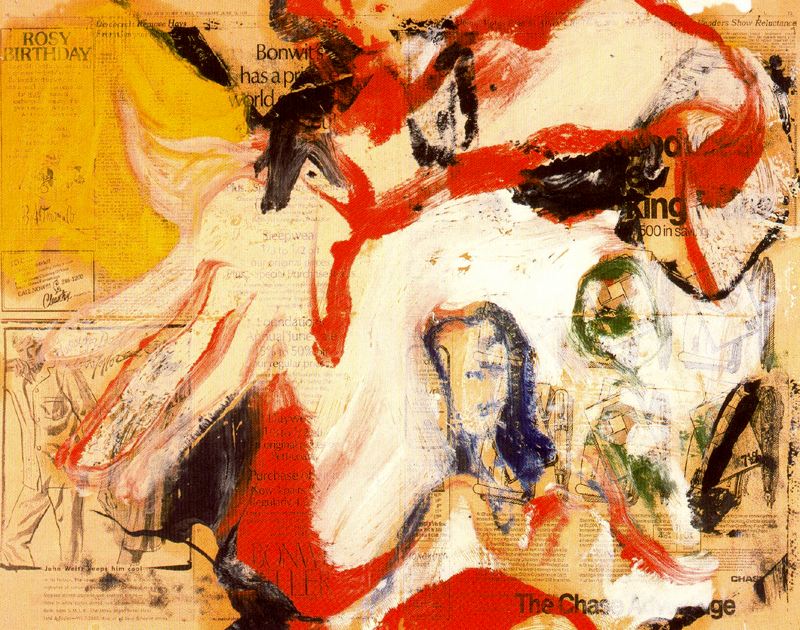
Another mid-40's thing— I wish there was a better photo of this one:

It looks like we're getting into the 1960's here— his stuff became loose in the extreme, and the hatchet-like stroke that was his trademark through the 50's became softened, wavier. Much of that work is very obscure, but here's a friendly example:
In the 70's he kept that wavy line, but became more shimmering, less slobbery, and his (well-hidden!) subject matter seems to move away from nudes and towards landscape:

This is from late in his career. He was suffering from Alzheimer's, and reactions to his work of this period is mixed, but this one is very nice:

This seems to be a transitional work from the 70's stuff to his very clean late work. Probably not his greatest painting ever, but there's a Matisse-like lightness here that you don't see elsewhere in his work:

This too, a little later than the previous one, probably, when he began using spatulas to apply the paint. This crimson is another color he used a lot, which other painters try to stay away from. The superficialities change, but it's clearly the same artist throughout all of these phases; if anything, his famous, high-abstract expressionism of the 50's is the stylistic outlier.

No comments:
Post a Comment